10.3. Plotting with seaborn#
Broken interactivity
Interactive features at this page currently don’t work, so we’ve added code outputs as figures. Do try out the code lines in your local VS Code. You can download the penguins dataset used throughout this section here.
Let’s next explore how to simply make plots out of pandas DataFrames data using seaborn. To start working with the seaborn library, we use the following import line:
import seaborn as sns
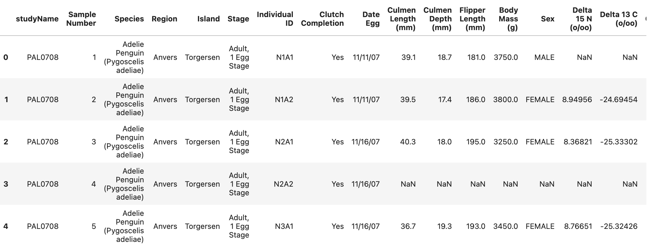
Let’s look at an example with our penguins dataset.
import pandas as pd

penguins = pd.read_csv("penguins.csv")
print(penguins.head(5))
import seaborn as sns
import matplotlib.pyplot as plt

# Scatter plot with seaborn
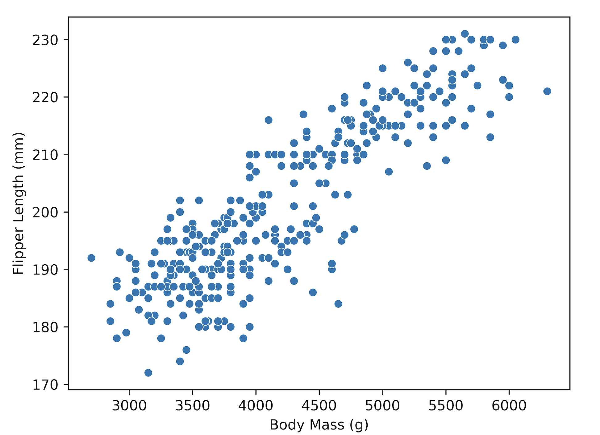
sns.scatterplot(data=penguins, x="Body Mass (g)", y="Flipper Length (mm)")
plt.show()
plt.show() with seaborn
If in the future you start using seaborn in Jupyter notebooks instead of in VS Code, importing matplotlib.pyplot and using plt.show() can be ommitted in the code above.
pd.read_csv vs. sns.load_dataset
In the seaborn code example, you may see the usage of sns.load_dataset.
You can use sns.load_dataset when you want to quickly access and use built-in datasets provided by seaborn for quick visualizations or exploratory data analysis.
However, when you need to work with your own dataset, use pandas.read_csv.
Notice how all selections happen within sns.scatterplot function - you can define your pandas DataFrame as data, and pass column names of your DataFrame as x and y. Also, the labels of x- and y-axes are added automatically, which is quite convenient!
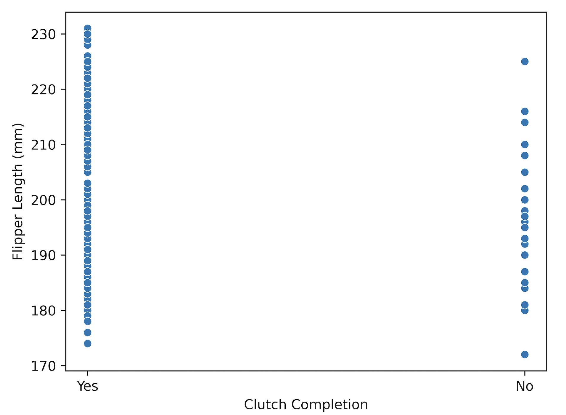
In this case, we selected two columns with numerical values, but it would also work with a non-numeric column, e.g., Clutch Completion.
sns.scatterplot(data=penguins, x="Clutch Completion", y="Flipper Length (mm)")
plt.show()
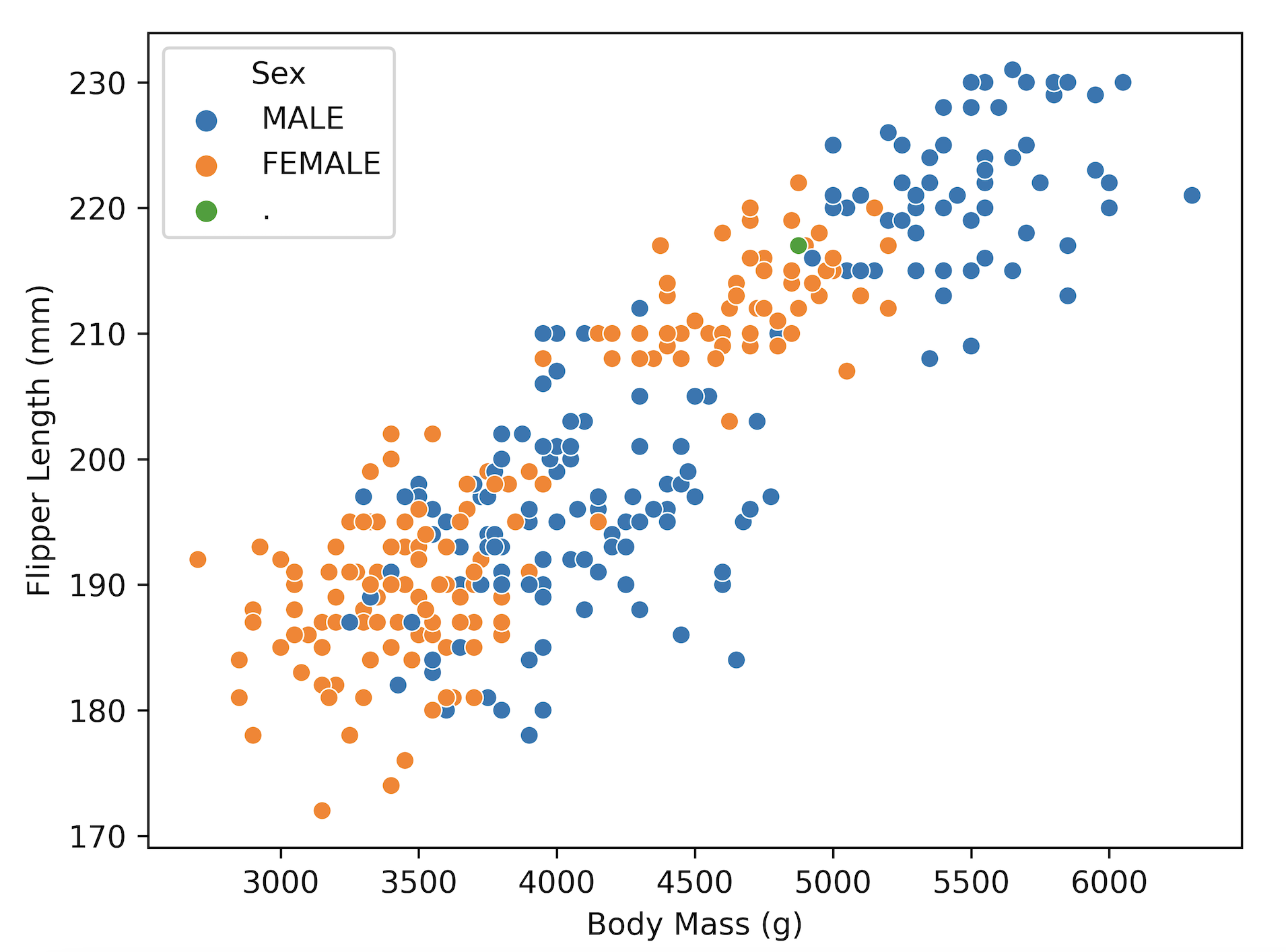
If you wanted to make a more fine-grained distinction in your plot, e.g., color data points by values in another column, that’s also possible. Let’s say you’re interested which data points in the Body mass (g) vs. Flipper length (mm) plot belong to male or female penguins. You can use hue for that - seaborn will then give different colors base on the values in the column Sex. Conveniently, it also creates a legend for you and tries to find an optimal position for it.
sns.scatterplot(data=penguins, x="Body Mass (g)", y="Flipper Length (mm)", hue="Sex")
plt.show()
If you wish to add even more data, e.g., also account for Species, you can do that by assigning different symbols (markers) based on the values in the Species column. We can easily do that with the style argument:
sns.scatterplot(data=penguins, x="Body Mass (g)", y="Flipper Length (mm)", hue="Sex", style="Species")
plt.show()
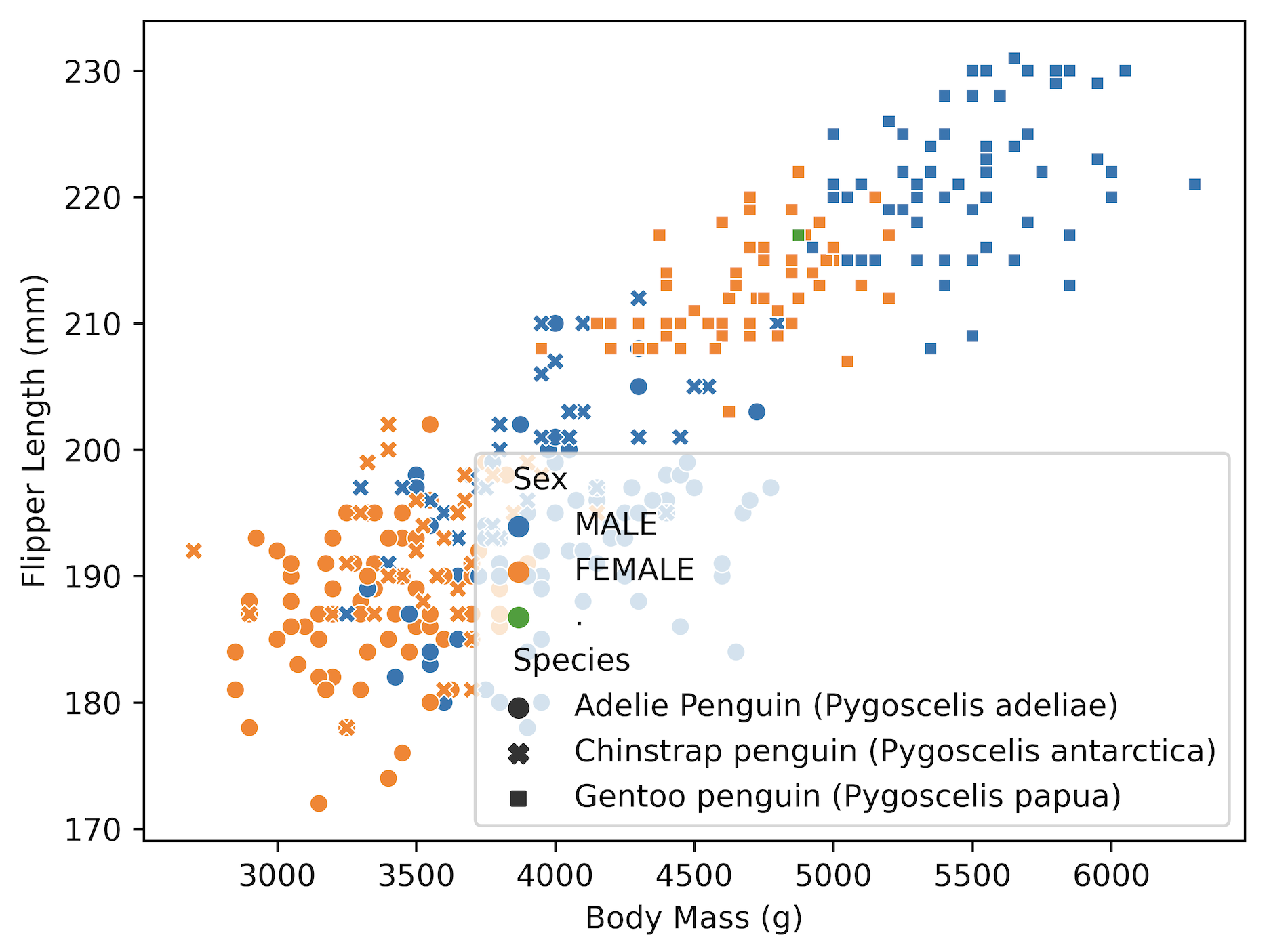
We notice that the position of the legend is now overlapping with our data, so let’s move it to the side:
ax = sns.scatterplot(data=penguins, x="Body Mass (g)", y="Flipper Length (mm)", hue="Sex", style="Species")
sns.move_legend(ax, "upper left", bbox_to_anchor=(1, 1))
plt.show()
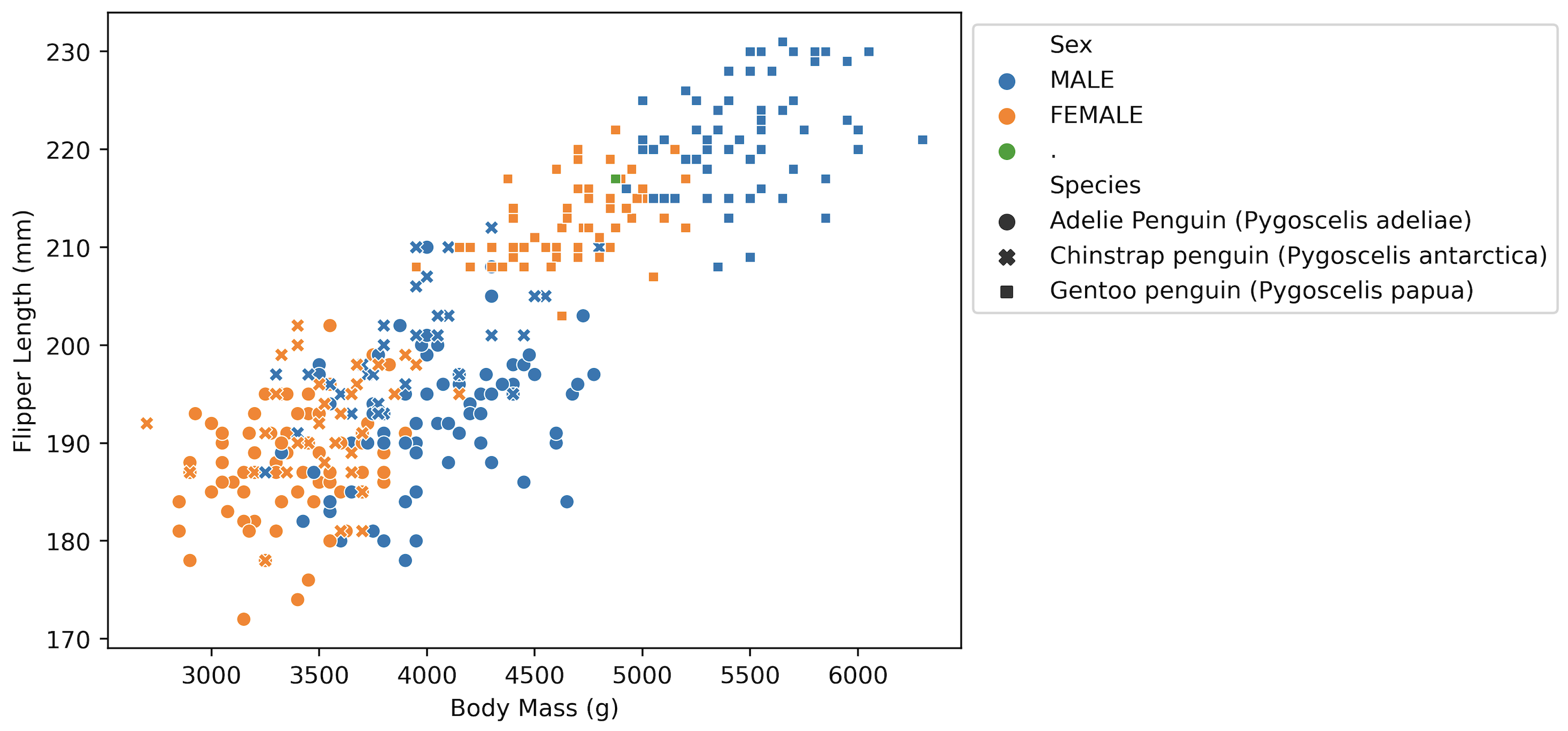
If the legend is getting cut-off by the pop-up window boundary, you can try using an extra line - plt.tight_layout() - in your code. Alternatively, you can explore online the figure sizing options for seaborn plots.
If you now wanted to save this figure, you could use this line of code:
ax.figure.savefig("Figure_name.png", dpi=600)
where dpi makes sure your figure is of high quality. If the figure is quite wide (like the one where we move the legend to the side), you can also add bbox_inches = "tight" to make sure it doesn’t get cut out.
Tip
In our examples, we used sns.scatterplot. As you can imagine, seaborn offers many more plot types, which you can easily access with, e.g., sns.barplot, sns.boxplot, etc.
