10.1. Data visualization in Python#
Recall the example dataset we worked with in the previous chapter, where we had voltage measured for 1,000 time points. Our dataset looked like this:
[[ 0.00000000e+00 -4.88196842e-01]
 [ 1.00100100e-02  6.57403884e-01]
 [ 2.00200200e-02 -4.86876718e-01]
 ...
 [ 9.97997998e+00  2.11430345e+01]
 [ 9.98998999e+00  1.94693126e+01]
 [ 1.00000000e+01  1.82114232e+01]]
With a thousand rows of data and floating point numbers, it’s impossible for humans to get a good grasp of this data from looking at a table. Is the relationship between time and voltage linear? Is it logarithmic? Does the data behave the way we would expect it to according to our knowledge of physics? Are there any strange measurements or outliers (data points that significantly differ from other points)?
Whenever you work with data, ALWAYS make sure to plot it before you start analyzing it. Plotting is essential to get an idea of what’s inside your data. Also keep in mind that one image is worth a thousand words - it’s much easier to understand and convey messages with images and plots than with words and tables. That’s why you will see numerous illustrations and plots in scientific publications and in your textbooks. For our time-voltage data above, the plot looks like this:
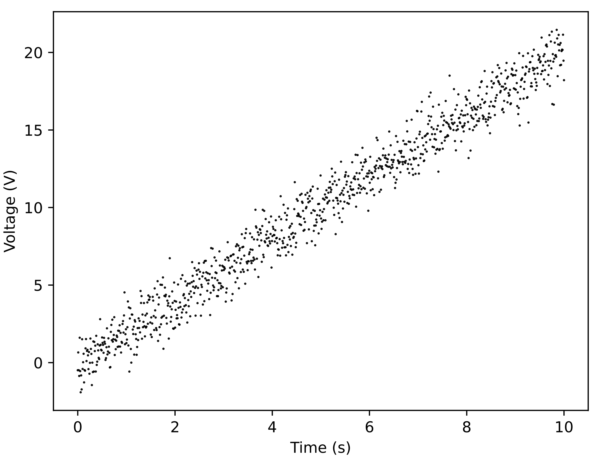
Fig. 10.1 When we plot measured voltage for different time points, we immediately spot a linear trend in the data. We also see that, while there is some spread in the data (i.e., not all data falls on one line), there are no obvious outliers (e.g., an outlier would be a data point at position \((2,15)\).#
As we’ll see later, in addition to plotting data, we can also easily plot functions in Python.
Plotting in Python offers more options compared to, e.g., Excel. It also allows you to work with much larger datasets. In this course, we will explore how to plot data in Python using two different libraries: Matplotlib and seaborn.
Interactive plots
While we won’t explore it in this book, it’s nice to know that there are also options for interactive plotting in Python using different libraries, such as Plotly, Bokeh, ipywidgets, etc.
While primarily meant for static plotting, Matplotlib and seaborn can also produce interactive plots with the use of widgets, e.g., from matplotlib.widgets import Slider, Button.
Before we delve into plotting syntax, we’ll explore features of these two libraries and discuss general guidelines for good plotting.
10.1.1. Matplotlib vs. seaborn#
Both Matplotlib and seaborn are powerful data visualization libraries and offer functionalities for creating basic plots (line plots, scatter plots, etc.), customizing plot aesthetics (colors, labels, etc.), handling large datasets efficiently, and integration with pandas. What are then differences between these libraries?
Fig. 10.2 Matplotlib vs. seaborn library for plotting.#
Matplotlib is a comprehensive library for creating static and interactive visualizations, and it integrates well with NumPy and pandas. Matplotlib offers a lower-level approach with extensive customization, making it ideal when you need detailed control over a plot.
seaborn is built on top of Matplotlib and provides a high-level interface for drawing statistical graphics. It works seamlessly with pandas DataFrames. seaborn is designed to easily create complex visualizations, it often requires less code to generate complex plots, and comes with built-in themes and color palettes to make visualizations more visually attractive compared to Matplotlib.
When should you use each of these libraries?
Ease of use:
Matplotlib offers more control and customization options but at a cost of more complicated code.
seaborn is generally simpler for creating complex visualizations.
Aestetics:
Matplotlib has more basic default plots which are customizable.
seaborn has more attractive default aesthetics.
Statistical functions:
seaborn includes functions for easy statistical plotting (e.g., boxplot, violinplot), while Matplotlib doesn’t have those (it can be combined with other libraries for such purposes).
Available code:
Matplotlib is a much older library than seaborn, so you will find more Matplotlib code written by others.
Choose your favourite library
For most plots, any of these libraries will work, so it will be up to your personal preference which one to use for your plotting. Therefore, for most exercises in this book, you have a free choice of using whichever library you like more, as long as you produce good plots in the end.
10.1.2. Good visualization practices#
You can think of plotting as storytelling - with plotting, you’re trying to convey messages in a clear and easily understandable way. Plotting also aids your analysis and understanding of your data. For each element in your plot, ask yourself: Is it helping make my data more understandable?
What are the important elements to consider when plotting?
Axes:
ALWAYS label your axes with name and (when applicable) unit! Otherwise, nobody knows what you’re plotting.
Consider the ranges of your axes. An intuitive origin point is \((0,0)\). However, the range always depends on your data - you want the layout and spread, differences, and trends in your data to be well visible, so choose ranges accordingly. If you show subplots that one is supposed to compare, make sure that the axes are of the same range across all subplots.
Colors:
Choose colors depending on what you’re showing. There are several types of color palettes:
Qualitative: contrasting colors are useful for categorical information. Every color has the same perceived weight.
Sequential: for showing something that goes from low to high.
Diverging: there is a central neutral value from which the colors diverge in two extremes.
Note that some color combinations and color palettes are not color-blind friendly. Choose ones that are.

Fig. 10.3 Examples of different color palettes (figure source, figure license).#
Legend:
The meaning of different colors in a plot is not obvious unless we include a legend.
Other recommendations:
Avoid clutter. If there is too much information to show, consider using subplots.
Annotate things in your plot when appropriate.
Choose plot type(s) carefully (see section below).
Book recommendation
If you want to learn more about good visalization practices, we recommend a book by a physicist-turned-science communicator:
Jean-luc Doumont: Trees, maps, and theorems: Effective communication for rational minds.
10.1.2.1. Plot type#
An essential step in any plotting is selecting an appropriate plot type. The plot type has to make sense for your data. Also, choosing the appropriate plot type will make it easier and more intuitive for others to understand your data.
Note: sometimes the best choice will be combining more than one plot type within a single plot.
There are many plot types available, as you can see in these example galleries of Matplotlib and seaborn. Let’s take a look at some of the most commonly used types.
10.1.2.1.1. Scatter plot#
Scatter plots are also known as xy-plots. You’ve seen an example of a scatter plot above with our time-voltage data (Fig. 10.1). In general, scatter plots are appropriate for:
Showing the correlation of two variables
Visualizing how data points are distributed across the range of variables
Finding clusters (groups) in the data
Identifying outliers

Fig. 10.4 Iris dataset with four measurements for three species of iris (we’ve encountered this dataset earlier). Panel A. The scatter plot suggests that there is a correlation between petal width and length, i.e., as one becomes larger, the other one does too. We can clearly see the distribution of the data, where petal length varies between 0 and 7 cm, and petal width is between 0 and 2.5 cm. There appear to be clusters in the data, e.g., Iris setosa has both smaller petal length and petal width than the other two species. We also introduced an artificial outlier - this is data point that clearly stands out from the rest of the data. In reality, an outlier would be “hidden” among the iris data. Panel B. The same data (but without outlier) plotted as a line plot. The line plot type clearly doesn’t make sense for this data.#
10.1.2.1.2. Line plot#
We’ve just seen an example of bad usage of a line plot. So when is it appropriate to use it? Typically, you use the line plot when you want to visualize trends. Often, lines are used in combination with another plot type, such as scatter.
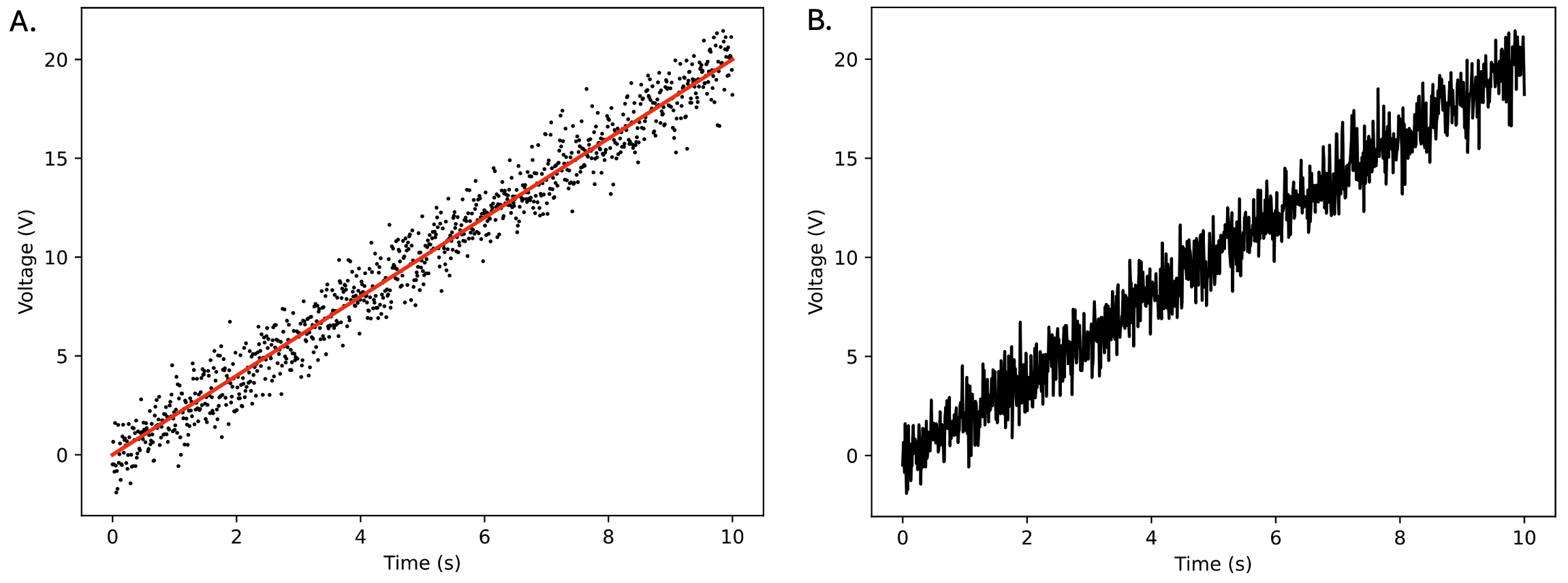
Fig. 10.5 Time-voltage dataset. Panel A. Data points are shown as dots. We can see that voltage increases roughly as \(2 \times time\), so we plot the underlying trend as a red line. Panel B. Data points connected by the line (i.e., a line plot instead of a scatter plot). Note how this makes it much more difficult to see what the actual measurements were.#
Scatter + line
As you may note, our red line didn’t pass exactly through all the points in the time-voltage plot. In practice, there often does not exist a single line that goes exactly through all the data points. This raises the question: what straight line fits “best” through data points?
In the case of a straight line, we can mathematically determine this using least-squares fitting, also known as linear regression; this is commonly used with lab-obtained data. More generally, with “fitting” we are trying to find the curve that best describes our data - this way we can learn about underlying relationships in our data, or link our data with theory.
We often plot out data as scatter (to show what we actually measured) and plot the fitted curve on top.
10.1.2.1.3. Bar plot#
A bar plot is ideal for comparing quantities across different categories or groups. It is also effective for highlighting differences between groups.
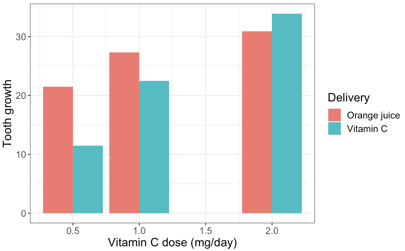
Fig. 10.6 Bar plot highlighting differences in tooth growth between two groups (“Vitamin C” and “Orange juice”) under different doses. Data is based on ToothGrowth dataset.#
10.1.2.1.4. Histogram#
What if we had only one variable to plot, so neither scatter nor line plot is suitable? In these cases, we can resort to histograms. With histograms, we are plotting the distribution of a dataset, i.e., they show the frequency of data points within specified ranges (the so-called bins). Histograms are useful to get an idea about the central tendency (highest peak in the data), variability (spread), and presence of outliers. Sometimes we also use histograms to compare distributions for different datasets (such as in figure below) or to compare a distribution with a theoretical one (like normal distribution).
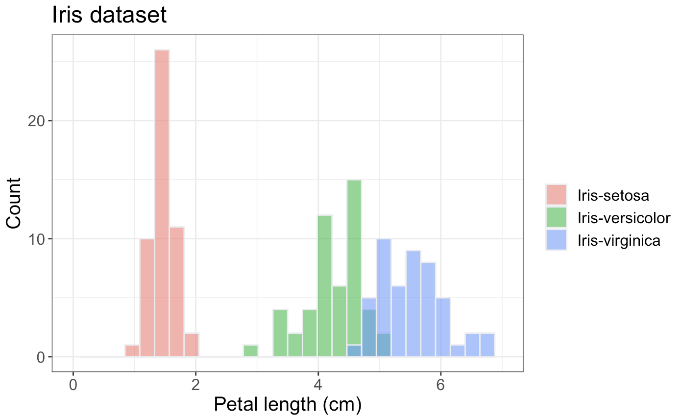
Fig. 10.7 Histogram showing the distribution of petal lengths for three iris species.#
10.1.2.1.5. Boxplot and violinplot#
A boxplot is commonly used to compare the distribution of several groups. How is that different from histograms? With boxplots, the data distribution is hidden behind each box, e.g., a normal distribution could look exactly the same as a bimodal distribution. To circumvent this, you can also resort to a violinplot which gives a better impression of the data points distribution.

Fig. 10.8 Boxplot (panel A) and violinplot (panel B) showing the distribution of petal lengths for three iris species, the same distribution that was earlier shown as a histogram.#
How do we actually read a boxplot?
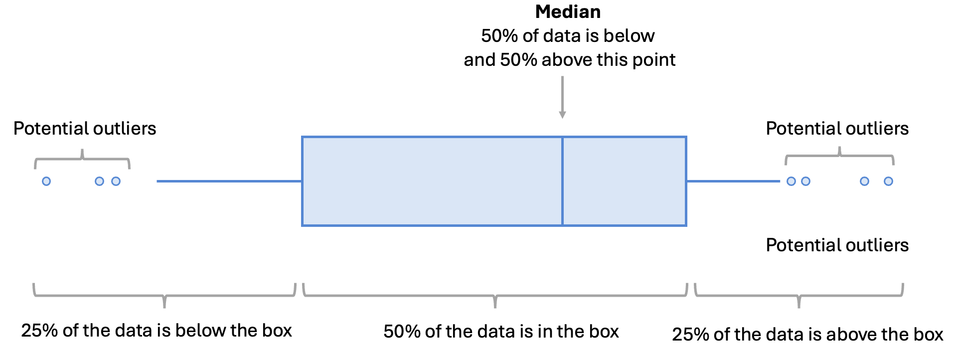
Fig. 10.9 Boxplot elements explained.#
10.1.2.1.6. (Advanced) Heatmap#
Often in bioinformatics and biophysics, you will see data represented as a heatmap, e.g., differential expression data or matrices evaluating model performance as we vary two variables. With heatmaps, we essentially plot a large amount of data in a colored matrix. While it’s sometimes difficult to see exact values from such a plot (because values are shown as hues of a color), heatmaps are intuitive way of showing patterns and groups in large data.
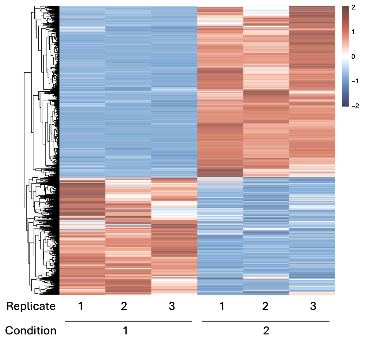
Fig. 10.10 Heatmap showing differential expression (transcriptomics data) for three replicates in two different conditions. We can see that there are two clear groups: RNAs (y-axis) that in all replicates get down-regulated (blue) in condition 1 and up-regulated (red) in condition 2, and the other way around.#
