
8. 2D Line Plots#
In this module we’ll focus on using Python for making plot. We will use Matplotlib library, which is a popular data visualization library, widely used for creating static, animated, and interactive plots. It provides a comprehensive framework for generating a variety of plots and charts, including line plots, bar charts, scatter plots, histograms, and more.
8.1. Plotting a line in Python#
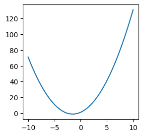
You can use the Matplotlib library to plot lines in Python. Let’s say you want to plot a line with the equation: \(y=x^2+3x+1\). You can’t simply give your line’s equation to Python. Instead, you need to give Python an array of \(x\) points and their respective \(y\) points. Here is how you do it:
First, make evenly spaced \(x\) points in the range you are interested in, using the
linspace()function from NumPy.Next, find their respective \(y\) values using the line’s equation.
Finally, use the
plot()function to plot them.
import matplotlib.pyplot as plt
import numpy as np

# Specify the figure size in inches
plt.figure(figsize=(3, 3))

# Specify the figure size in inches
plt.figure(figsize=(3, 3))

# Define the range you want for x
x = np.linspace(-10,10,100) # 100 points from -10 to +10 (including)

# Find the corresponding y values for x using the equation
y = x**2+3*x+1

# Plot the points using Matplotlib
plt.plot(x, y)

# Show the plot
plt.show()
<Figure size 300x300 with 0 Axes>
8.2. Customizing your plot#
You can customize your plots to have a given size, style, color, labels and title. These are optional commands in Python; if not specified, default values will be used for them, or they will simply be ignored. There are different styles to define these values. Below you can see some of the common options and how to specify them.
In the plot() function, after giving the array of \(x\) and \(y\) values, you can specify the line style followed by the line color. Additionally, you can change the width of the line for a thicker or narrower line by adding linewidth=number. You can also specify a label for the line by using label=" " (the label will be shown after calling plt.legend()). Moreover, you can add a title, a grid, and x and y labels to your plot, as well as setting the width and length of your graph. A table for all of these is provided below.
Syntax |
Effect |
|---|---|
|
Solid Line |
|
Dotted Line |
|
Dashed Line |
|
Dash-dotted Line |
|
Red Line |
|
Blue Line |
|
Green Line |
|
Black Line |
|
Changing Line Width |
|
Adding a label/legend |
|
Sets the width [a,b] of the graph |
|
Sets the length [c,d] of the graph |
|
Adds the x-label to the graph |
|
Adds the y-label to the graph |
|
Adds the title to the graph |
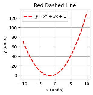
An example of plotting a line with customization, is given in the code below.
# Specify the figure size in inch
plt.figure(figsize=(3, 3))

# Define the range you want for x
x = np.linspace(-10,10,100)
y = x**2+3*x+1

# Plot dashed red line
plt.plot(x, y,"--r",linewidth=2.2,label="$y=x^2+3x+1$")

# Label for x axis
plt.xlabel('x (units)')
# Label for y axis
plt.ylabel('y (units)')
# Title
plt.title('Red Dashed Line')

# Adding grids
plt.grid()
# Showing the line's label/legend
plt.legend()
# Showing the plot
plt.show()
8.3. Multiple lines in one plot#
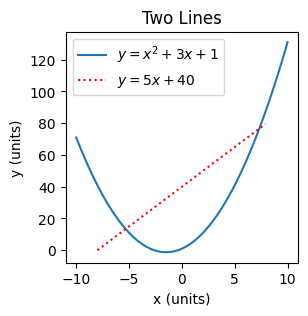
To plot multiple lines in one plot you can simply repeat using plt.plot() for each line with new \(x\) and \(y\) values. Python will automatically assign different colors to each new line, but to make your figures more distict you can use different line styles and a label for each line. See the example below.
Note that here we use np.arange(start, stop, step_size) to create evenly spaced points from start to stop (excluding) with fixed stepsize.
# Specify the figure size in inch
plt.figure(figsize=(3, 3))

# Line 1, old line
x = np.linspace(-10,10,100)
y = x**2+3*x+1
plt.plot(x, y,label="$y=x^2+3x+1$")

# Line 2, new line
x2= np.arange(-8,8,0.1)
y2=5*x2+40;
plt.plot(x2, y2,":r",label="$y=5x+40$")

# Labels and title
plt.xlabel('x (units)')
plt.ylabel('y (units)')
plt.title('Two Lines')

# To show the line labels/legend
plt.legend()

# To show the plot
plt.show()
8.4. Figure with subplots#
pyplot.subplots(nrows, ncols) creates a figure and a grid of subplots with nrows rows and ncols columns. You can then access these subplots separately and then plot your lines. Below is an example.
# Define x and y
x = np.arange(0, 2*np.pi, 0.1)
y1 = np.cos(x)
y2 = np.sin(x)

# Making a figure with 2 by 2 subplots
fig, axs = plt.subplots(2, 2)
#
axs[0, 0].plot(x, y1)
axs[0, 0].set_title('cos(x)')
#
axs[0, 1].plot(x, y2, 'k')
axs[0, 1].set_title('sin(x)')
#
axs[1, 0].plot(x, -y1, 'g')
axs[1, 0].set_title('-cos(x)')
#
axs[1, 1].plot(x, -y2, 'r')
axs[1, 1].set_title('-sin(x)')

# Add main title
plt.suptitle("Main Title")

# Quick way to add similar x and y labels to all subplots
for ax in axs.flat:
    ax.set(xlabel='x-label', ylabel='y-label')

# Hide x labels and tick labels for top plots and y ticks for right plots. For a more readable figure
# only if figures have similar x and y range
for ax in axs.flat:
    ax.label_outer()

#
fig.tight_layout()
plt.show()

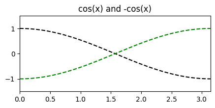
You can also create subplots with multiple functions in them. Below you can find an example of this, where -cos(x) & cos(x) and -sin(x) & sin(x) have each been merged into one subplot respectively. Try to understand how the code and syntax works.
import matplotlib.pyplot as plt
import numpy as np

# Define x range
x = np.linspace(0, np.pi, 500)

# Label each of the functions
x1 = np.cos(x)
x2 = -np.cos(x)
x3 = np.sin(x)
x4 = -np.sin(x)

# Create first figure and subplot
fig1, sub1 = plt.subplots(figsize=(5,2))
sub1.plot(x, x1, "--k")
sub1.plot(x, x2, "--g")
plt.xlim(0,np.pi)
plt.ylim(-1.5,1.5)
sub1.set_title('cos(x) and -cos(x)')

# Create second figure and subplot
fig2, sub2 = plt.subplots(figsize=(5,2))
sub2.plot(x, x3, "-.r")
sub2.plot(x, x4, ":b")
plt.xlim(0,np.pi)
plt.ylim(-1.5,1.5)
sub2.set_title('sin(x) and -sin(x)')

# Display the plots
plt.show()

8.4.1. Exercise: Graph and line customization#
In this exercise, you must plot the sine function y = np.sin. The graph must be customized according to the specifications listed below:
The graph must display two periods of the function using appropriate values for
np.linspace(). (Hint: one period is from “0” to “np.pi” on the x-axis).The line must be black and dashed.
Add the line’s label (legend) “y=sin(x)” as well as the x and y labels “x” and “y” respectively.
Set the x limit from \(-\pi\) to \(\pi\). Also set the y limit from -1.5 to 1.5
Add grids to your graph.
Hint: Copy and paste the relevant parts of the syntax from examples 1 and 2 and change the values to match the specifications.
# your code here
8.4.2. Exercise: Plotting two lines#
In this exercise, you must combine two lines into one graph. The functions you need to plot this are the following:
y1 = 2*np.pi*xy2 = 1 / (2*np.pi*x)
You must also set the xlim and ylim to a suitable value.
(Optional) If you like, you may also customize your graph by, for example, specifying the line color or line type, adding a legend, et cetera.
Hints: Copy paste the relevant syntax of Example 3. Also keep in mind that your linspace must not go through 0, as that would mean y2 will be divided by zero for x = 0.
# your code here
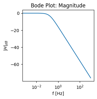
8.5. Changing x or y axis to a logarithmic scale#
If required, you can simply change the scale of x or y axis to a logarithmic scale by using plt.yscale('log') and plt.yscale('log') respectively. Note that this doesn’t change the values; just the spacing within the points will be on a logarithmic scale. However, to convert the values to dB you can code manually by using 20*np.log10(). In the example below, we sketch the bode magnitude plot of an RL series circuit where R=1, L=1 and the output is the voltage across R.
# Specify the figure size in inches
plt.figure(figsize=(3, 3))

f = np.arange(0, 10**3,0.001) # frequency
H_abs = np.abs(1/(1+1j*(2*np.pi*f)*1)) # H magnitude

# Labels and titles
plt.xlabel('f [Hz]')
plt.ylabel('$|H|_{dB}$')
plt.title('Bode Plot: Magnitude')

# Plotting the points
plt.plot(f, 20*np.log10(H_abs))
plt.xscale('log') # This line changes your x-axis to log scale

# Function to show the plot
plt.show()
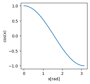
8.6. Save your figure#
To save your figure you can use plt.savefig. The first argument of this function is a filename with the desired extension. To have a good quality picture you should specify the DPI too; dpi=300 is a good option for your reports. Note that the figure will be stored in your Files and will be deleted after the runtime is recycled, so make sure you download it. You can access the Files by clicking on the folder icon on the side ribbon on the left.
import matplotlib.pyplot as plt
import numpy as np

# Define x range
x = np.linspace(0, np.pi, 500)
# Label each of the functions
y = np.cos(x)


# Specify the figure size in inch
plt.figure(figsize=(3, 3))
# Plot dashed red line
plt.plot(x,y)


# Labels and titles
plt.xlabel("x[rad]")
plt.ylabel("cos(x)")


# Saving the figure as png
plt.savefig('test_fig.png', dpi=300)


# Saving the figure as pdf
plt.savefig('test_fig.pdf', dpi=600)
8.7. Plotting data from Excel#
You may have your data (x and y points) stored as separate columns in an Excel file. To plot this data you need to first import it from the Excel file. You can use the function read_excel() from the pandas library to do that efficiently. This reads the file into a DataFrame object (see the DataFrame documentation in pandas.DataFrame). A pandas DataFrame stores the data in a tabular format, just like Excel displays the data in a sheet. To access each column of the dataframe object you can use the column name.
The code below is an example; it reads the data from an Excel file from a download url, and stores them in data_points. To see the column names and the first five rows of the data you have imported from the Excel file, you can use data_points.head(). The x points are in a column called “Frequency (Hz)” and the y points in the column are called “|Z| Impedance [Ohm]”.
Another option is to first upload your file to the session storage. You can click on the “Files” icon on the side ribbon on the left and then click on the “upload to session storage” icon; then you can only give the read_excel function the file name.
import pandas as pd
data_points= pd.read_excel('https://drive.google.com/u/0/uc?id=1z0d96LsbrtVJaF1-N-PLITlgCo0xT-Li&export=download')
data_points.head()
---------------------------------------------------------------------------
ModuleNotFoundError                       Traceback (most recent call last)
Cell In[10], line 1
----> 1 import pandas as pd
      2 data_points= pd.read_excel('https://drive.google.com/u/0/uc?id=1z0d96LsbrtVJaF1-N-PLITlgCo0xT-Li&export=download')
      3 data_points.head()

ModuleNotFoundError: No module named 'pandas'
x=data_points["Frequency (Hz)"]
y=data_points["|Z| Impedance [Ohm]"]

plt.figure(figsize=(3, 3))
plt.plot(x, y);
plt.xlabel('Frequency (Hz)', fontsize=14)           # Adding x label
plt.ylabel(r'|Z| Impedance ($\Omega$)', fontsize=14) # Adding y label
plt.xscale("log")                                   # Changing xscale to log
Note that pandas and matplotlib are widely-used foundational libraries in the realm of data science (with Python), and therefore getting well-acquainted with them is an essential requirement if you will be doing any data analysis and manipulation with Python.
8.7.1. Exercise: From Excel document to downloading a graph#
In this exercise, you will download a graph which you will plot based on an Excel document.
The first step is importing the Excel document. You can follow the required steps as explained above.
The second step is plotting this graph and then downloading it.
import pandas as pd

data_points= pd.read_excel('https://drive.google.com/u/0/uc?id=1gcQf7dXrxL1ENudjAGGTbpB-T63avPQt&export=download')
data_points.head()
# your code here
8.8. Optional: Other types of graphs#
The Matplotlib library also offers built-in functions for creating various types of graphs. Some of these are the scatter plot, bar graphs, histograms and pie charts. Below is a table for these types of graphs and their respective functions. For now it is mostly important that you are aware that they are available and that you know how to find the proper syntax whenever you need them. Also, an example plot for each one will be provided.
Type of Graph |
Function |
|---|---|
Scatter Plot |
|
Bar Graph |
|
Histogram |
|
Pie Chart |
|
Here is an example of a scatter plot with two sets of data.
import matplotlib.pyplot as plt
import numpy as np

# Specify the figure size in inch
plt.figure(figsize=(3, 3))

x1 = np.array([2,4,6,7,5,3,5,1,3,9,2,0,4])
y1 = np.array([101,96,69,85,102,92,84,88,99,92,102,94,98])
plt.scatter(x1, y1)

x2 = np.array([3,3,4,8,5,15,9,4,5,4,12,3,10,13])
y2 = np.array([90,95,93,84,105,80,91,103,89,98,85,102,87,83])
plt.scatter(x2, y2)

plt.show()
Here is an example of a bar graph with the amount of various types of fruit displayed.
import matplotlib.pyplot as plt
import numpy as np

# Specify the figure size in inch
plt.figure(figsize=(3, 3))

x = np.array(["Apples", "Bananas", "Oranges", "Pears"])
y = np.array([5, 9, 7, 2])

plt.bar(x,y)
plt.show()
Below is an example of a histogram, where the distribution of the exam results is plotted. Note that each vertical bar has a certain width which we call a “bin”. You can specify the value for this bin, but it is not strictly needed; if you leave it out, a default value will be chosen.
import numpy as np
import matplotlib.pyplot as plt

# Specify the figure size in inch
plt.figure(figsize=(3, 3))

# Exam scores of 100 students (note that these are randomly generated)
np.random.seed(20)  # This is for generating a random set of samples
scores = np.random.normal(loc=75, scale=10, size=100)  # Mean=75

# Create a histogram
plt.hist(scores, bins=10) # a bin is the width of each vertical bar
plt.title('Distibution of Exam Results')
plt.xlabel('Results')
plt.ylabel('Amount of Students')
plt.show()
Here is an example for the pie chart, where the distribution in percentages for passing leisure time is given. Using plt.pie() you can plot a pie chart. For the ways of customizing your chart, look up the syntax for doing so, in case you ever need it.
import matplotlib.pyplot as plt

# Specify the figure size in inch
plt.figure(figsize=(3, 3))

# Preferred methods for passing leisure time
labels = ['Books', 'Movies', 'Social Media', 'Sports', 'Socialising', 'TV Series', 'Others']
sizes = [15, 5, 30, 10, 1, 32, 7]  # Percentages
colors = ['#ff9696','#66c3ff','#99fe99','#ffcc99','#c2c2f0','#feb3e6','#c4e17f'] # Specifying the colors is optional

# Create a pie chart
plt.pie(sizes, labels=labels, colors=colors)
plt.title('Distribution of Ways for Passing Leisure Time')
plt.show()
8.9. More examples#
For a more extensive example please see: Plotting for EPO1